> For the complete documentation index, see [llms.txt](https://docs.antsomi.com/cdp-365-user-guide-en/llms.txt). Markdown versions of documentation pages are available by appending `.md` to page URLs; this page is available as [Markdown](https://docs.antsomi.com/cdp-365-user-guide-en/insights/reports/create-reports/build-stylize-and-add-data-to-reports/chart-references/bullet-chart-reference.md).
# Bullet chart reference
Bullet charts give you a way to quickly see how well a given metric is performing against target benchmarks. Bullet charts are simple, having just 3 components:
* A center bar showing the actual value of the metric you are graphing
* A vertical line showing a target value
* Colored bands that represent threshold ranges, such as poor, average, and good
Bullet charts are often used in dashboards to provide meter or gauge-like widgets that monitor various "health" or performance KPI (key performance indicators).
### Bullet charts in Insights
Bullet charts in **Insights** visualize a single metric. You can optionally display a target value, and set up to 3 ranges. You can also change the chart colors, and apply data filters.
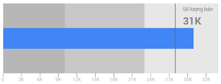
**Example:**
The bullet chart below is based on quantity sold metric for a fictional store. At a glance, you can see that the average grade exceeds the target:
* The center bar shows the metric value (31K, in this example)
* The vertical bar shows the target quantity sold (set at 28K in the chart configuration)
* The colored bands in the graph show the ranges for poor, average, and good quantity sold.
### Configure the chart
Select the chart, then on the right, use the properties panel to configure the chart options.
### Data properties
The options in a chart's data properties panel affect how the data is organized and displayed.
#### Data source
A data source provides the connection between the component and the underlying data set. Data source options are:
* To change the chart's data source, click the current data source name.
* To view or edit the data source, click . (You must have at least view permission to see this icon.)
* Click **+BLEND DATA** to see data from multiple data sources in the same chart. [Learn more about data blending](broken://pages/-Mg-eddkiH4GsFKtbWPG).
#### Date range dimension
This option appears if your data source has a valid date dimension.
The Date Range Dimension is used as the basis for limiting the date range of the chart. For example, this is the dimension used if you set a date range property for the chart, or if a viewer of the report uses a date range control to limit the time frame.
#### Metric
Metrics measure the things contained in dimensions and provide the numeric scale and data series for the chart.
Add metrics to the chart by dragging fields from the *Available Fields* panel on the right. You can also click **Add metric** in the *Data* tab.
Bullet charts can have a single metric.
#### Range limits
Range limits specify the threshold values for the chart. Ranges often indicate "poor," "average," and "good" thresholds. By default, bullet charts set the range values to 1, 2, and 3. You should adjust these to better fit your actual data. You can remove a range from the chart by setting it to 0. If you don't want ranges at all, set all 3 ranges to the same value (use a value large enough to display the metric value).
| Range 1 | Set the threshold for the "poor" range. |
| ------- | ------------------------------------------ |
| Range 2 | Set the threshold for the "average" range. |
| Range 3 | Set the threshold for the "good" range. |
#### Target
Lets you specify the target value for the chart.
| Show target | Shows or hides the vertical target bar |
| ------------ | -------------------------------------- |
| Target value | Set the target value. |
#### Default date range
The default date range property lets you set a timeframe for an individual chart*.*
**Default date range options**
| Auto | Use the default date range determined by the chart's data source. |
| ----------------- | ----------------------------------------------------------------------------- |
| Custom | Lets you use the calendar widget to select a custom date range for the chart. |
| Date compare type | Displays comparison data for the selected time period. |
#### Filter
The filter property restricts the data displayed in the component by including or excluding the values you specify*.* [Learn more about the filter property.](broken://pages/-Mg-W453l9ay2_t65YKP)
**Filter options**
| Filter name | Click an existing filter to edit it. Mouse over the filter name and click **X** to delete it. |
| ------------- | --------------------------------------------------------------------------------------------- |
| +Add a filter | Creates a new filter for the chart. |
### Style properties
A chart's style properties control the overall presentation and appearance of the chart.
#### Bar colors
This section controls the appearance of the center value bar and the ranges.
| Bar color | Sets the color of the value bar. |
| ----------- | -------------------------------- |
| Range color | Sets the color of the ranges. |
#### Axis
Controls the appearance of the chart axis.
| Show axis | Shows or hides the chart axis. |
| ----------- | ---------------------------------------- |
| Font color | Sets the color of the axis labels. |
| Font family | Sets the font family of the axis labels. |
#### Background and border
These options control the appearance of the chart background container.
| Background | Sets the chart background color. |
| ----------------- | ---------------------------------------------------------------------------------------------------------------------------------------------------------- |
| Border Radius | Adds rounded borders to the chart background. When the radius is 0, the background shape has 90° corners. Border radius of 100° produces a circular shape. |
| Opacity | Sets the chart's opacity. 100% opacity completely hides objects behind the chart. 0% opacity makes the chart invisible. |
| Border Color | Sets the chart border color. |
| Border Weight | Sets the chart border line thickness. |
| Border Style | Sets the chart border line style. |
| Add border shadow | Adds a shadow to the chart lower and right borders. |
#### Chart Header
The chart header lets viewers perform various actions on the chart such as exporting the data or viewing the chart in the Explorer tool. Chart header options are:
| Show on hover (default) | Three vertical dots appear when you mouse over the chart header. Click these to access the header options. |
| ----------------------- | -------------------------------------------------------------------------------------------------------------------- |
| Always show | The header options always appear. |
| Do not show | The header options never appear. Note that report viewers can always access the options by right clicking the chart. |
| Color | Set the color of the chart header options. |
### Related resources
* [Filter property](broken://pages/-Mg-W453l9ay2_t65YKP)
---
# Agent Instructions
This documentation is published with GitBook. GitBook is the documentation platform designed so that both humans and AI agents can read, navigate, and reason over technical content effectively. Learn more at gitbook.com.
## Querying This Documentation
If you need additional information that is not directly available in this page, you can query the documentation dynamically by asking a question.
Perform an HTTP GET request on the current page URL with the `ask` query parameter, and the optional `goal` query parameter:
```
GET https://docs.antsomi.com/cdp-365-user-guide-en/insights/reports/create-reports/build-stylize-and-add-data-to-reports/chart-references/bullet-chart-reference.md?ask=&goal=
```
`ask` is the immediate question: it should be specific, self-contained, and written in natural language.
`goal` is optional and describes the broader end goal you are ultimately trying to accomplish on behalf of the user. GitBook uses it to tailor the answer towards what is most useful for that goal.
The response will contain a direct answer to the question and relevant excerpts and sources from the documentation.
Use this mechanism when the answer is not explicitly present in the current page, you need clarification or additional context, or you want to retrieve related documentation sections.