# Work with color
## How to color your reports
Make your data story beautiful.
Consistent and meaningful use of color makes your reports more attractive and easier to understand. You can apply color and style options to a variety of aspects of a report, including static elements, such as, page and component backgrounds, text fonts and font colors, chart borders, grids, and so on. You can also apply colors to data elements, such as bars and lines, metric and dimension values, pie slices, and geographic regions.
Here are the ways you can work with color in Insights.
### Themes
Built-in color themes make it easy to quickly create attractive and visually consistent reports. When you apply a theme, it updates the settings for all the static and data elements in the report at once, saving you time and effort.
You can customize a theme by changing its properties.
### Style components individually
You can change color and style settings for individual components:
1. Edit the report.
2. Select a components.
3. On the right, open the STYLE tab.
4. Change the desired style settings. If you've selected more than one component, you'll only see settings common to all the selected components.
When you style an individual component, that component is no longer part of the report theme. If you apply a different theme, that component won't inherit the new theme's settings.
### Color your data
You can use the following techniques to color the data that appears in charts:
* **Color by the dimension value**. For example, "France" is always represented in blue, no matter where it appears in the chart. The dimension value colors are set by the current report theme, but you can override them by editing the dimension value color map.
* **Color by the order of the dimension data**. For example, the first series in the chart is always blue. You can set the series colors by editing individual charts.
* **Use shades of a single color**. This option is most effective when you don't need to show exact differences between values in the chart.
You can use different techniques in the same report, if that makes sense for your data.
Learn more about [data coloring techniques.](#how-to-color-your-reports)
### The color picker

Use the color picker to select colors for themes and components. The color picker has 3 sections:
1. The standard color palette. This is the same for all components in every report.
2. The theme palette. This will change depending on your current theme.
3. Custom color palette. Custom colors you create appear here.
#### To access the color picker:
1. Edit your report.
2. Select a component and then open the STYLE tab, or customize the current theme.
3. Click a color option to display the color picker, then select the color you want for that option.

#### Create custom colors

Click + in the CUSTOM colors row of the color picker to create a custom color. Click anywhere in the color bars to pick a base color, then use the sliders to adjust the shade. You can also enter a color hex value to render that color. The current color's hex value can also be used to exactly duplicate a custom color in another component.
For example, in the image on the right, the blue color swatch has the hex value `#4285f4`. You can copy and paste this value into another object's color picker to set it to this soothing shade of blue.
## Color your data
Learn about the coloring options available in Insights.
Insights provides 3 options for coloring your data. To apply an option:
1. Select a chart and then on the right, open the STYLE tab.
2. Data coloring options appear in the *Color by* section.

### Color by dimension values
Coloring by dimension values applies consistent colors to the data series in your charts by mapping specific colors to specific dimension values.
The default dimension value colors are based on the current report theme, however can choose different colors by [editing the dimension value color map.](#the-dimension-value-color-map)
**Example**
In the charts below, the colors used for each dimension stay constant, even if their position in the chart changes: France is always blue, Germany is always red, India is always green
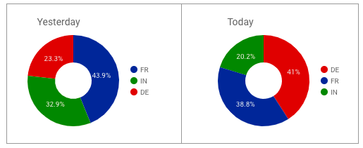
*Example of coloring by dimension value.*
#### Color by series order
The series order option colors the data according to its order in the chart. This option emphasizes the ranking of the data over the identity of the data. For example, let's say you want the highest valued dimension to always appear in green. Using the color by series order option, you can assign that color to the first color swatch in the current theme.
**Example**
These charts use the color by series order (called *slice order* in the Pie Chart properties panel) option. Here, dark blue represents the highest valued dimension, rather than a specific country.
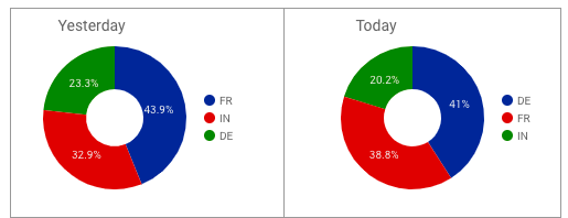
*Example of coloring by series order.*
#### Set series colors
To change the colors assigned to data series in a specific chart:
1. Select that chart, then on the right, open the STYLE tab.
2. In the *Color by* section, select **Series order, Bar order,** or **Slice order**, depending on the type of chart.
3. Click a color box to set the color for each series. The color boxes appear in rank order: the first color box corresponds to the first series, the second box to the second series, and so on.

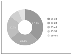
#### Single color
Bar charts and pie charts have a single color option that displays the data in shades of the selected color, as shown in the example below.
## Themes
Use predefined color schemes to style your reports instantly.
Themes are a set of predefined color and style combinations you can apply to your reports. Applying a theme updates the style settings of your charts, tables, background color, and text, helping to ensure your reports are visually attractive and stylistically coherent.
### The default theme
All new reports start with a default theme. The colors and style settings of this theme are designed to be both attractive and accessible to viewers with color blindness.
### Apply a theme
1. Edit the report.
2. Open the *Theme and Layout* panel:
1. The *Theme and Layout* panel appears on the right whenever no components are selected.
2. You can also click **Theme and layout** in the toolbar.
3. In the THEME tab, click the theme you want to apply.

### Create a custom theme
Create a custom theme by changing the current theme settings.
1. Edit the report.
2. Open the *Theme and Layout* panel.
3. Select the Themes tab.
4. In the Current Theme section, select Custom.
#### What you can customize
The *Edit theme* panel lets you customize the following settings:
| Primary styles | |
| ------------------------------------------------------------------------------------------------------------------------------------------------ | ------------------------------------------------------------------------------------------------------------------------------------------------------------------------------------------------------- |
| | **Report background** sets a default page background color for all pages in report. |
| **Text style** sets default font color and font family for text in the report, including text boxes, data labels, legend labels, control labels. | |
| Accent styles | Set default font color and font family for text accents, including table headers, filter control and date range control headers, and control "apply" buttons. |
| Textbox styles | Set default background color, font color and font family, and border visibility for textboxes. |
| Color by | Specify the default fill color for the charts in the report |
| Single color | When selected, the data series is displayed in a single color. |
| Color by series order | Use the current theme to color the data according to its position in the chart. This option emphasizes the ranking of the data relative to the identity of the data. |
| Dimension value color | Color each dimension value in the chart with the color specified in the dimension value color map. This option ensures that your data uses color consistently, regardless of its position in the chart. |
### Reset a chart to the current theme
To restore a component you've changed back to the report theme:
1. Edit the report.
2. Select the component.
3. In the properties panel on the right, select the *STYLE* tab.
4. At the bottom of the panel, click **Reset to report theme**.
Resetting a chart to the report theme won't reset any custom colors you've set in the [dimension value color map](#the-dimension-value-color-map).
### Limits of themes
* Custom themes aren't shared across reports. To reuse a custom theme in another report, make a copy of the report with the custom theme.
* Themes apply to the entire report. It's not possible to apply different themes on separate pages of a report. You can, however, override themes by styling individual components.
* You can have one custom theme at a time. Modifying an existing theme creates a new custom theme, overwriting any previous custom theme.
* Changing themes doesn't override any custom styles you've applied to text boxes.
## **Use conditional formatting rules in Insights**
Color your data based on logical conditions.
You can set the font and background colors used in your charts based on the data. For example, if *Campaign* is "Summer Sale," then set the entire table row font color to green, or if *Clicks* is less than 100, set the scorecard background color to red.
### **Single color conditional formatting**
Single color conditional formatting applies a specific font color and background color to your data. Single color conditions can include:
* Dimensions
* Metrics
* Multiple conditions using AND/OR logic.
**Use single color formatting on a table**
**Use single color formatting on a pivot table**
**Use single color formatting on a scorecard**
**Select any field**
The "Select any field' option lets you define a single color format rule based on any field in the chart.

1. Select any field.
### **Color scale conditional formatting**
Color scale conditions let you evaluate a single metric against its percentage or absolute numeric value.
**Use color scale formatting on a table or pivot table**
**Use color scale formatting on a scorecard**
### **Compound format rules**
Conditional formatting rules can include multiple conditions using OR or AND logic.
For example:
*Product ID* containts "P001" OR *Size* is M will format rows that match either condition.

*Product ID* containts "P001" AND *Size* is L will format rows that match both conditions.

You can have up to 10 AND clauses. Each clause can have up to 10 OR conditions.
### **What you can format**
You can apply conditional formatting to the following portions of your charts:
**Format the entire row**
The **Entire row** option applies the colors you select to every row in the table that matches the condition.
**Format a specific field**
To format a specific field in a table, select that field from the menu.
For scorecards, or tables using **Select any field**, this option appears as **Cells**, and is the only option available.

**Drill down dimensions and optional metrics**
You can apply formatting rules to drill down dimensions and optional metrics. However, the rules only take effect when those fields are visible in the chart or table.
### **How to select colors**
As noted at the beginning of this article, you can use single colors or a color scale to format your charts.
**Single colors**
Use the color pickers to select the font color and background color to the target values for each condition. You'll see an example appear on the right.
**Color scale**
Data points determine the minimum, middle, and maximum values of your color scale. By default, a new color scale defines 3 data points based on percentages, with preset colors (red, yellow, green). You can base the scale on absolute numbers, and select different colors for each data point.
You can have a maximum of 5 data points and a minimum of 2 data points.
* To add more data points, hover over an existing data point and click Add  .
* To remove a data point, hover over it and click Delete
.
* To remove a data point, hover over it and click Delete  .

**Use preset colors based on your current theme.**
Click the down arrow to the right of the color scale preview to select a preset color scale. These preset scales are based on your report theme, making it easier to keep your report visually consistent. The bottom 2 color scales are optimized specifically for visually impaired users.
**Reverse the color scale**
To swap the order of the minimum and maximum colors, click Reverse color scale
.

**Use preset colors based on your current theme.**
Click the down arrow to the right of the color scale preview to select a preset color scale. These preset scales are based on your report theme, making it easier to keep your report visually consistent. The bottom 2 color scales are optimized specifically for visually impaired users.
**Reverse the color scale**
To swap the order of the minimum and maximum colors, click Reverse color scale  .
### **Format rules, percentages, and decimal precision**
When building rules that compare numbers, be sure to use the actual value in the data, rather than the value displayed in charts. For example, to build a format rule that selects values greater than 51.2%, use the decimal value: *`Bounce rate`*` ``> .512` Similarly, numbers displayed in your charts may be rounded up or down. Be sure to include as many digits as necessary in your rule to properly match the underlying data. For example, a rule such as Bounce rate = .512 wouldn't apply if the actual value was .5119, even though that number appears as .512 when rounded to 3 decimal places. You can adjust metric decimal precision in the chart's STYLE tab.
### **Edit and delete conditional formatting rules**
1. Edit your report.
2. Select the chart with the rule you want to edit.
3. On the right, Click **STYLE**.
4. At the top, in the *Conditional formatting* section, click Edit
.
### **Format rules, percentages, and decimal precision**
When building rules that compare numbers, be sure to use the actual value in the data, rather than the value displayed in charts. For example, to build a format rule that selects values greater than 51.2%, use the decimal value: *`Bounce rate`*` ``> .512` Similarly, numbers displayed in your charts may be rounded up or down. Be sure to include as many digits as necessary in your rule to properly match the underlying data. For example, a rule such as Bounce rate = .512 wouldn't apply if the actual value was .5119, even though that number appears as .512 when rounded to 3 decimal places. You can adjust metric decimal precision in the chart's STYLE tab.
### **Edit and delete conditional formatting rules**
1. Edit your report.
2. Select the chart with the rule you want to edit.
3. On the right, Click **STYLE**.
4. At the top, in the *Conditional formatting* section, click Edit  , then for the rule you want to change, click
  or
or  **.**
### **Copy conditional formatting rules**
Copy and paste a chart with conditional formatting to create a new chart with those same rules.
### **Limits of conditional formatting**
* Single color conditional formatting is currently available for tables, pivot tables, and scorecards.
* Color scale conditional formatting is currently available for tables and scorecards.
* Conditional formatting on pivot tables that use Expand-Collapse only works if the rule is based on "Any value."
* Dimension-based compound conditions in pivot tables must use the same field in each OR condition.
* Format rules can only use fields currently contained in the chart.
* You can have up to 20 format rules per chart.
* Switching between chart visualization types (for example, switching a table to a scorecard, or a pivot table to a table) may require you to update conditional formatting rules, depending on the type of chart and the fields used in the rule.
## The dimension value color map
The *dimension value color map* is a table of the dimension values that appear in your report, with an associated color for each value. Charts that use the color by dimension values option get their colors from this map. The dimension value color map is created automatically from the data in your report. You can also edit the map directly to add values and change colors.
### How the dimension value color map works
#### For editors
Whenever you add or edit a chart, any new dimension values displayed by that chart are added to the map. The colors in the map come from the report-level color theme currently in effect when the values are added.
**Example**
In a new blank report, the dimension value color map is empty. If you add a pie chart with the *Country* dimension, and limit it to 3 slices, the dimension value color map now contains 3 values, one for each of the countries appearing in chart.

If you then edit the chart and increase the number of slices to 10, the new country values are added to the dimension value color map.
Next, you add a time series broken down by the *Source* dimension. The new dimension values are added to the map, so it now includes items like "google," "(direct)", "youtube.com," etc., along with colors for each value.

As you edit the report, only the dimension values actually displayed in the charts are added to the dimension value color map. Paginated charts, or charts that contain data only for certain date ranges, won't add to the map until those values are actually displayed.
The dimension value color map can contain a maximum of 1000 entries. If the map exceeds this limit, you'll be prompted[ restore the default colors](/insight-report-user-guide/insights/reports/create-reports/build-stylize-and-add-data-to-reports/work-with-color.md#restore-default-colors). Currently, there is no way to selectively remove values from the map.
#### For viewers
When someone views dimension values that haven't been added to the dimension value color map, Insights will select colors automatically. These colors might be different for different viewers, and won't be added to the map.
### Manage dimension value colors
From the chart properties panel, *STYLE* tab, under the **Color by** options, click **Manage dimension value colors**.
### Add a new value to the map
To add an individual value to the dimension value color map:
1. Edit the dimension value color map using one of the methods above
2. Click **Add a value**
3. Click the color swatch to select a new color, if desired
4. Enter the new value
5. Click **CREATE VALUE**.

### Change the color of an existing value
To change a value's color:
1. Edit the dimension value color map using one of the methods above
2. Locate the value to change (use the Search box on the right if you have lots of values)
3. Click the color swatch for that value
4. Select the new color.
### Restore default colors
To reset the dimension value color map:
1. Edit the dimension value color map using one of the methods above
2. In the top left corner, click **RESTORE DEFAULT COLORS**.

Restoring the dimension value color map will discard any values you've added manually. In addition, the new map will only contain values for the charts currently displayed on the report page. **There's no way to undo this**, so please proceed with caution
---
# Agent Instructions: Querying This Documentation
If you need additional information that is not directly available in this page, you can query the documentation dynamically by asking a question.
Perform an HTTP GET request on the current page URL with the `ask` query parameter:
```
GET https://docs.antsomi.com/insight-report-user-guide/insights/reports/create-reports/build-stylize-and-add-data-to-reports/work-with-color.md?ask=
```
The question should be specific, self-contained, and written in natural language.
The response will contain a direct answer to the question and relevant excerpts and sources from the documentation.
Use this mechanism when the answer is not explicitly present in the current page, you need clarification or additional context, or you want to retrieve related documentation sections.
**.**
### **Copy conditional formatting rules**
Copy and paste a chart with conditional formatting to create a new chart with those same rules.
### **Limits of conditional formatting**
* Single color conditional formatting is currently available for tables, pivot tables, and scorecards.
* Color scale conditional formatting is currently available for tables and scorecards.
* Conditional formatting on pivot tables that use Expand-Collapse only works if the rule is based on "Any value."
* Dimension-based compound conditions in pivot tables must use the same field in each OR condition.
* Format rules can only use fields currently contained in the chart.
* You can have up to 20 format rules per chart.
* Switching between chart visualization types (for example, switching a table to a scorecard, or a pivot table to a table) may require you to update conditional formatting rules, depending on the type of chart and the fields used in the rule.
## The dimension value color map
The *dimension value color map* is a table of the dimension values that appear in your report, with an associated color for each value. Charts that use the color by dimension values option get their colors from this map. The dimension value color map is created automatically from the data in your report. You can also edit the map directly to add values and change colors.
### How the dimension value color map works
#### For editors
Whenever you add or edit a chart, any new dimension values displayed by that chart are added to the map. The colors in the map come from the report-level color theme currently in effect when the values are added.
**Example**
In a new blank report, the dimension value color map is empty. If you add a pie chart with the *Country* dimension, and limit it to 3 slices, the dimension value color map now contains 3 values, one for each of the countries appearing in chart.

If you then edit the chart and increase the number of slices to 10, the new country values are added to the dimension value color map.
Next, you add a time series broken down by the *Source* dimension. The new dimension values are added to the map, so it now includes items like "google," "(direct)", "youtube.com," etc., along with colors for each value.

As you edit the report, only the dimension values actually displayed in the charts are added to the dimension value color map. Paginated charts, or charts that contain data only for certain date ranges, won't add to the map until those values are actually displayed.
The dimension value color map can contain a maximum of 1000 entries. If the map exceeds this limit, you'll be prompted[ restore the default colors](/insight-report-user-guide/insights/reports/create-reports/build-stylize-and-add-data-to-reports/work-with-color.md#restore-default-colors). Currently, there is no way to selectively remove values from the map.
#### For viewers
When someone views dimension values that haven't been added to the dimension value color map, Insights will select colors automatically. These colors might be different for different viewers, and won't be added to the map.
### Manage dimension value colors
From the chart properties panel, *STYLE* tab, under the **Color by** options, click **Manage dimension value colors**.
### Add a new value to the map
To add an individual value to the dimension value color map:
1. Edit the dimension value color map using one of the methods above
2. Click **Add a value**
3. Click the color swatch to select a new color, if desired
4. Enter the new value
5. Click **CREATE VALUE**.

### Change the color of an existing value
To change a value's color:
1. Edit the dimension value color map using one of the methods above
2. Locate the value to change (use the Search box on the right if you have lots of values)
3. Click the color swatch for that value
4. Select the new color.
### Restore default colors
To reset the dimension value color map:
1. Edit the dimension value color map using one of the methods above
2. In the top left corner, click **RESTORE DEFAULT COLORS**.

Restoring the dimension value color map will discard any values you've added manually. In addition, the new map will only contain values for the charts currently displayed on the report page. **There's no way to undo this**, so please proceed with caution
---
# Agent Instructions: Querying This Documentation
If you need additional information that is not directly available in this page, you can query the documentation dynamically by asking a question.
Perform an HTTP GET request on the current page URL with the `ask` query parameter:
```
GET https://docs.antsomi.com/insight-report-user-guide/insights/reports/create-reports/build-stylize-and-add-data-to-reports/work-with-color.md?ask=
```
The question should be specific, self-contained, and written in natural language.
The response will contain a direct answer to the question and relevant excerpts and sources from the documentation.
Use this mechanism when the answer is not explicitly present in the current page, you need clarification or additional context, or you want to retrieve related documentation sections.